Tailored Solutions. Proven Methodology. Global Workforce.
Build Better Data to Power Better AI
Data Collection
Data Annotation
Large Language Model
AI Machine Learning
Talk to our Experts
Trusted Internationally
Our Global Enterprise Customers
Alegion AI is the trusted and most reliable company in the data collection and annotation market. We can be the game-changer for you too.
Common Issues
Challenges in Data Annotation and Acquisition Projects
About 33% of machine learning projects get stuck during the proof of concept stage.

Missing the right skill sets and expertise to annotate accurately.

Too costly to acquire the skill set, tools, and execute in-house.

Insufficient quality or not the right data for labeling/annotation.

Inability or unfeasible to scale the team to the required size for a project.
Our data annotation & data collection services empower your AI through skilled workforces, quality data and proven partnerships.
Our commitment
We annotate complex data with guaranteed accuracy.
What we offer
Data Annotation Services
Teaching a computer to see is a complex and painstaking process. We offload your data annotation needs with speed and accuracy by utilizing our managed workforce experts for Data Collection, Annotation and Quality Control.
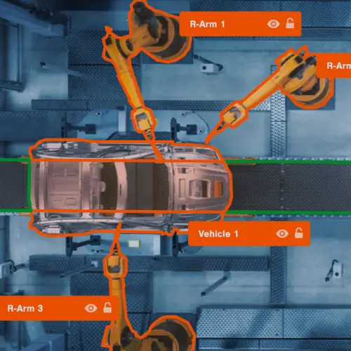
Robotic Manufacturing
Data Collection
We begin the process by defining the project's goal, specifying the ML problem statement, and identifying a reliable dataset either from your data library archives or through acquisition.
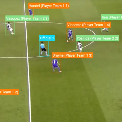
Sports Analysis
Data Annotation & Labeling
We optimize annotation parameters to deliver the desired data. The project is matched to a qualified workforce of annotators to deliver annotations according to the quality, budget, and timeline.
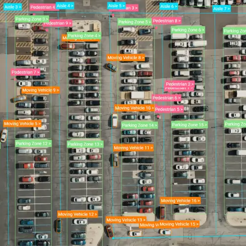
Consumer Study

Data Transformation & Quality Checks
Throughout the project, we calibrate the project with continuous quality improvement. Our Quality Assurance team addresses quality issues as soon as they are found to prevent costly delays.
Our global workforce lets us scale up our end-to-end data annotation & collection services to meet your requirements
Simply put, we build better data for you to power better AI.
Why we're different
Quality Data for AI Projects
Our value proposition
Alegion AI transforms unstructured data into high-quality, model-ready training data through our team of data experts, AI-powered annotation services, and a skilled global workforce.
Validated Solutions
Every use case is different. Our experts take the time to understand your goals & establish a sophisticated annotation strategy. We optimize until your model reaches a higher caliber of performance.
Faster Delivery Time
Our AI-powered tools reduces annotation time by up to 50%. Our workflow has direct feedback from annotators to ensure task efficiency. We can scale the team to dozens or hundreds of skilled workers.
Competitive Pricing
We can reduce the cost of highly complex annotation projects through intuitive annotation software, optimized task design, proven workflow configuration and a globally sourced workforce.

Responsive Partnership
We operate on principles of excellent customer service and a commitment to responsible AI. Our team is reachable throughout the entire data preparation pipeline and workflow.
How to start
4 Steps to Kick Start
We help product, engineering, and data teams in leading enterprises deliver highly accurate annotations at cost-effective scales. We can help you build an AI machine-learning model for creating strategies to increase revenue. Here is how to start.
Let's talk. Connect with our AI/ML experts. We work with customers ranging from emerging startups to Fortune 50 companies. Good AI Machine Learning models and a robust training data will equip you to be a better business leader or a data scientist.
1
Free Preliminary Consultation
Our experts will take the time to understand your goals & establish a sophisticated annotation strategy. Whether we’re analyzing drone footage or customer generated images, we can provide the data for your model to get smarter and faster.
2
Set Goals & Objectives
We have the capacity and skill to meet your needs with data annotation tasks. That means you can focus on engineering a comprehensive learning solution without consuming scarce and costly in-house data science resources.
3
Annotate your AI/ML Project
Having a deep AI/ML learning solution with meaningful and accurate data means you can strategize, make better decisions, improve the speed of business, personalize your service, and expand your business model. It's time to go next-level.
4
Transform & Grow Your Business with AI
A Proven Approach to Accuracy
Our Methodology
Our in-house data annotation and labeling services cover the entire machine-learning lifecycle so that we can be your data partner as you iterate and optimize your model. This is how we do it.
Our Annotation Process
Workflow Management
Multi-Stage Workflow Configuration
Automated Data Pipeline
ML-Assisted Learning
Workforce Management
Vetted Global Workforce
Procure, Train, Enable
Effective Task Distribution
Managed Quality Control
Ground Truth, Review, Consensus
Iterative QC Process
Visualized Results & Reporting
Raw Data
Model-Ready Training Data
Images
Videos
Text
Audio
Computer Vision
Natural Language Processing


Trusted Across Industries
Serving Different Sectors
Alegion AI's data annotation services are the foundation for AI Machine Learning across a wide range of industries.
Annotate to create game-changing analytics
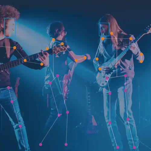
Sportlogiq, a company that uses artificial intelligence to provide sports analytics for team performance insights and enhanced media storytelling , needed a high volume of data annotations to increase the accuracy of a player tracking system. They used Alegion AI’s end-to-end managed service to optimize their annotation strategy, scale up annotations to 200,000 data points, and ultimately increase model accuracy by 70%.
Sports
Annotate to boost productivity, quality & safety
Invisible AI is a visual intelligence platform that tracks human motion to monitor the safety and productivity of manufacturing sites. The company needed a high-volume labeling service to supercharge an open source pose estimation dataset. They used Alegion AI’s end-to-end managed service to scale up annotations to 3,432,000 in 11 months and increase model accuracy to 79%.
Manufacturing
Annotate for Theft & Inventory Management
Annotation is a common solution for retail and e-commerce clients who need training data to save money on operational costs. One customer used Alegion AI to annotate hundreds of thousands of video frames, saving the grocery chain millions of dollars in theft and administrative errors.
Retail
Annotate for Insurance Claim Assessments
Whether we’re analyzing drone footage or customer-generated images, we can provide the data for your model to get smarter, and faster. A global insurance client saved millions of hours in home damage claim assessments by using Alegion AI to identify classes of roof damage and draw specialized polygons around fallen trees.
Insurance
Other Industries
Healthcare
Hospitality
Security
Construction
Get Started Today
Digital Transformation is driving a shift toward AI Machine Learning centric solutions and services. AI is not the future. It is now.
Start your AI journey now
Talk to our Experts